"House of Cards" is the show that really blew the lid off the potential of the web platform, so successfully that somehow even though it's one of the most acclaimed shows on the Internet, no one ever calls it a web series. It's managed to get the verbal promotion to TV show, regardless of the fact that it's never graced a broadcast television screen. I have to believe that at least some of that is due to its iconic cinematography. It's managed to be dissociated from the web platform because it doesn't look at all like what we expect a web show to look like. Instead it looks like a David Fincher film, never once sacrificing its aesthetic for an Internet budget. That's quite a feat when you consider that the look of the film has to be passed down from one artist to the next as different episode directors and DP's jump on and off the show.
A simple push-in does wonders for this show.

The season 1 Director of Photography, Eigil Bryld, noted that it became a challenge to have new directors conform to the style of shooting that they adapted after Fincher helmed the first two episodes. They never used handheld or steadicam, and they minimized pans and tilts. These might seem like minor restrictions, but they almost certainly change the perception of the show. It appears that in season 3 they put panning and tilting back on the menu, but nevertheless, these rules add immeasurably to the formality we see on screen. From the first episode everything Frank does is carefully calculated and that is wonderfully reflected in the way the camera moves. Steadicam provides a certain amount of flexibility that is inappropriate to the content. It's free flowing and can always adjust to find the right angle, whereas by putting the camera on the dolly for movement, you have to plan precisely where the actors and camera will stop and where they'll be looking to get the perfect shot. You compound the need for forethought by not allowing the operator to adjust the pan and tilt, so it really works as a perfect metaphor for Frank's world, but more importantly the sensation of how the camera moves affects the experience of the film, even if only subconsciously. In that regard, I think it was actually a pretty big mistake to include so much operating in the most recent season. It took away a certain mystique to how the shots were being designed and landing in perfect compositions.

The low angle here gives tension to this interaction.

Emphasizing the depth of the space.
On that note, it's important to point out just how thoughtful their compositions are throughout this latest season. One of my favorite ways of using the camera is to make camera height work in the storytelling. They will often opt for a high or a low angle shot. Sometimes it heightens the tension in a scene, sometimes it plays the practical role of bringing two elements into frame together that are simply at disparate heights, and sometimes it really just serves to break up what would become a monotony of eye-level shots. Having fun with the camera height has become a staple of the aesthetic of the show and it continuously helps in giving weight to the plight of the characters and the underground dealings they find themselves involved in. The filmmakers also have a few more staples that they keep harkening back to such as their use of depth and selective focus. We all instantly react to a shot that's framed to flaunt the depth of the composition; we respond to the sense of grandeur that it embodies. In this sense it doesn't have to be a medieval cathedral, but even something as simple as the way they frame Frank's cabinet meetings to have the members receding into the background, stacked one on top of the other adds to the formalism that's present throughout this work. We can see that there are many inconspicuous decisions that add up in creating a very precise image on screen.

The West Wing

Scandal
House of Cards
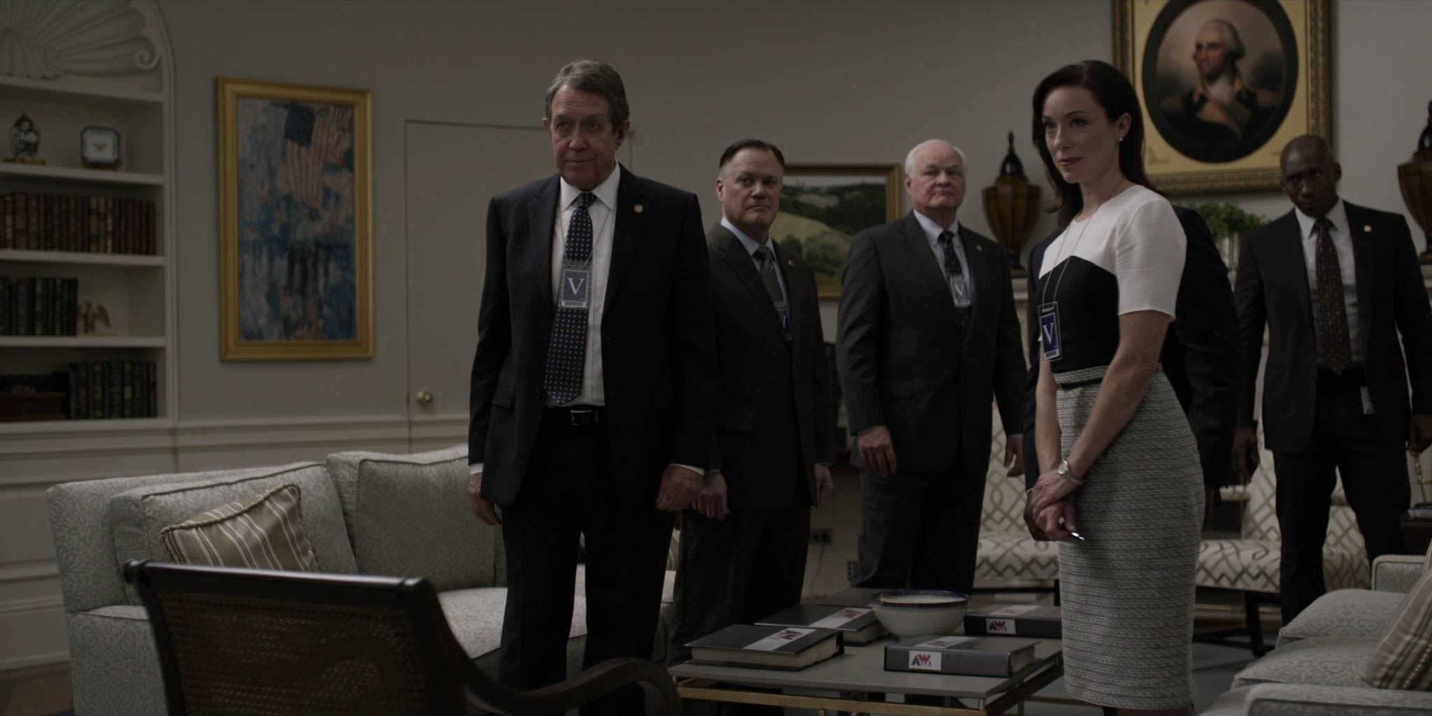
Fortunately for us, now that Frank has moved up to the White House, it gives us the opportunity to really square off the cinematography in "House of Cards" to some other shows because they are shooting on essentially the same sets. If you take a look at these frames of the Oval Office in "House of Cards" compared to "The West Wing" (1999) and "Scandal" (2012) we can see differences that highlight some of the subtleties that we take for granted when we're caught up in the drama of a show. The most obvious difference is the warmth from the shot from “The West Wing,” which differents quite jarringly from the other two shows. It just goes to show how even the most basic things are completely under the cinematographer’s control. Ahlgren could have made the frame from “House of Cards” just as warm, but of course that wouldn’t fit within the context of the show. While “TWW” is more about admirable and passionate politicians who work tirelessly to do what’s best for their country, “HoC” is about manipulative politicians who only work to increase their own power and influence. When you put it in that context, it’s a no brainer: “TWW” is warm and “HoC” is pallid and desaturated. To augment that point, “The West Wing” is known for its use of long steadicam shots moving in and out of rooms of the White House, something that would be a cardinal sin on set of “House of Cards.” Something else that’s worth touching on is how “House of Cards” makes ample use of soft, yet directional lighting. In the shot from “Scandal” you can see three or four unsightly shadows cast along the back wall by the fireplace and lighting fixtures. In the shot from “TWW” you can see some strange lighting patterns just over both shoulders of the character on the left of frame. In the case of “House of Cards” instead of strange light and shadows cast along the walls, there’s an impressively evenly lit wall, something that’s much more difficult than it looks. A big part of that is the fact that “House of Cards” seems to avoid hard light at all costs, which highly mitigates any problems that could occur with double shadows or awkward splashes on the walls. Also important is that the shots from “TWW” and “HoC” are covering essentially the same type of action, but in “House of Cards” they choose to go with a low angle shot that emphasizes that Frank’s political enemies may just be more formidable than they first appeared. Hopefully this emphasizes how even some of the obvious choices are still choices none the less that must be made in serving the story.

Darkness completely takes over the image.
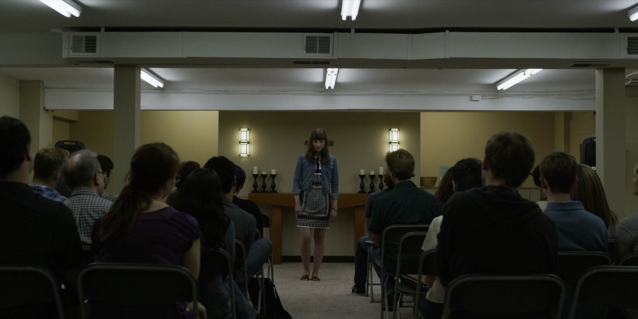
The show is known for going pretty brazenly into the shadows. Often characters are photographed in silhouette or just barely lit, which is absolutely essential to selling the world of “House of Cards.” Imagine if it were lit in the nonchalant, everyday manner of “The West Wing” while we watch The President arrange for the downfall of his political rival. That just wouldn’t work; it wouldn’t be believable; it would be too real. Our ability to buy into the narrative and suspend any disbelief is helped along by the lighting that paints the environment that these business deals go down in. That coat of paint hints to us that what we’re watching is outside of our status quo. We understand that in real life, things just aren’t that dark and gritty, but if we can buy into the imagery, we can buy into the narrative, and in this way the cinematography does its most noble task of really making the story resonate.
-Sheldon J.